

- Most service-based businesses lose leads due to poor UX, slow load times, and weak mobile design.
- Bad visuals, inconsistent branding, and low-quality images hurt credibility and drive visitors away.
- Technical issues, SEO gaps, and missing trust elements like social proof and contact info block growth.
Your website can either help your business grow or quietly cost you leads and sales. If it’s not bringing in calls, clicks, or bookings, chances are some underlying web design mistakes are causing the problem. This is especially true in website design for service businesses, where trust and clarity are everything.
Whether you’re based in Alberta or just looking to level up your online presence, this blog highlights everything that's holding back your website—and what top Edmonton web design teams do differently.
User Experience (UX) Mistakes
User experience is everything. It’s how people feel when they visit your site. Can they find what they’re looking for? Do things work like they expect? Is it easy to take the next step?
If visitors get confused, frustrated, or lost, they’ll leave—and probably won’t come back. A great website shouldn't just look good. It should also work well.
Here’s what gets in the way.
Clunky Navigation
Menus shouldn’t be a guessing game. Every second someone spends trying to figure out where to click is a second they’re thinking about leaving. One of the most common web design mistakes is offering too many choices or hiding important ones.
Instead, keep your navigation simple and label things clearly. Stick to the basics—Home, Services, About, Contact—and if you offer multiple services, create a dropdown menu under a single “Services” tab. Always have a clear and visible call to action, like “Book a Quote” or “Call Us Today.”
Slow Load Times
A slow website doesn’t just annoy people—it actively drives them away. Your potential client shouldn’t have to wait for a spinning wheel just to see your homepage. Beyond just user experience, it can also impact your visibility on Google.
Common causes include oversized images, cheap hosting, and plugins that don’t play nicely with each other. Run a speed test (Google PageSpeed Insights is free) and compress images, clean up unused code, and move to a better host if needed.
Weak Mobile Design
More than half of your visitors are likely using mobile devices. If your site doesn’t load correctly on a phone or tablet, you're missing out on leads. Buttons that are too small or layouts that break on smaller screens are red flags. Make sure mobile visitors can do everything desktop visitors can, without frustration.
Test your site across multiple screen sizes and browsers. Fonts should be legible, buttons should be big enough for thumbs, and layouts should adjust naturally. If your website still looks like it’s from 2013 on a phone, it’s time for an update.
Design and Branding Mistakes
Visual design is more than colors and fonts. It’s about making a connection. For service businesses especially, your website should feel like an extension of how you present yourself in person—clean, professional, and trustworthy.
A poor visual experience can make your business seem dated, disorganized, or less credible, even if your actual work is top-notch.
These are common pitfalls in website design for service businesses.
Inconsistent Visuals
Your brand design tells people who you are and what you stand for. But if your fonts change from page to page, your logo looks pixelated, or your colors don’t match your business cards, you’re sending mixed signals.
To fix it, use the same fonts, colors, and image styles throughout your site. Stick with 2–3 main colors and 1–2 fonts maximum. Create a simple brand style guide, or hire someone to help you create one. If your brand visuals look dated or like a copy-paste from different websites, invest in a design refresh that reflects your business as it stands today.
This is especially true in website design for service businesses, where trust and clarity are key. You want people to instantly feel like they’re in the right place when they land on your page.
Overloaded Pages
When every inch of your screen is filled with text, images, and buttons, it’s overwhelming. People skim—especially online. A cluttered layout causes decision fatigue, and decision fatigue causes exits.
A clean design with ample breathing space performs better.
- Use white space to guide the eye.
- Break large blocks of text into short paragraphs.
- Add visual breaks like images or icons.
Each page should have one clear goal—whether that’s reading about a service, booking a call, or submitting a form.
Low-Quality Images
Photos that are blurry, dark, or clearly stock images can turn people off. If you’re a local service provider, people want to see you, your team, your work—not generic images of strangers shaking hands.
Professional photos go a long way. Use real images of your work, your team, or your office. Take photos during actual jobs when you can. If you're not ready for a full photo shoot, even well-lit phone pictures of your actual projects are better than stock filler.
If you must use stock, choose ones that feel real and match your tone. Avoid overly staged or obviously fake pictures.
Mobile and Technical Mistakes
Even the best design can fall apart if the technical foundation isn’t solid. A professional website needs to be secure, functional, and updated. These behind-the-scenes issues are often overlooked, but they’re just as important.
Many of our Edmonton web design clients come to us with sites that look fine on the surface but are struggling due to technical oversights like the ones below.
No SSL Certificate
If your website shows up as “Not Secure” in someone’s browser, that's a major trust-breaker. It tells people your site might not be safe, and Google agrees—it’ll penalize unsecured sites in search results.
Make sure your hosting provider offers a free SSL certificate. An SSL certificate not only helps build trust but also impacts your Google rankings. Your URL should start with https://, not http://. It usually only takes a few clicks to activate, so don't compromise on this!
Broken Links and Missing Pages
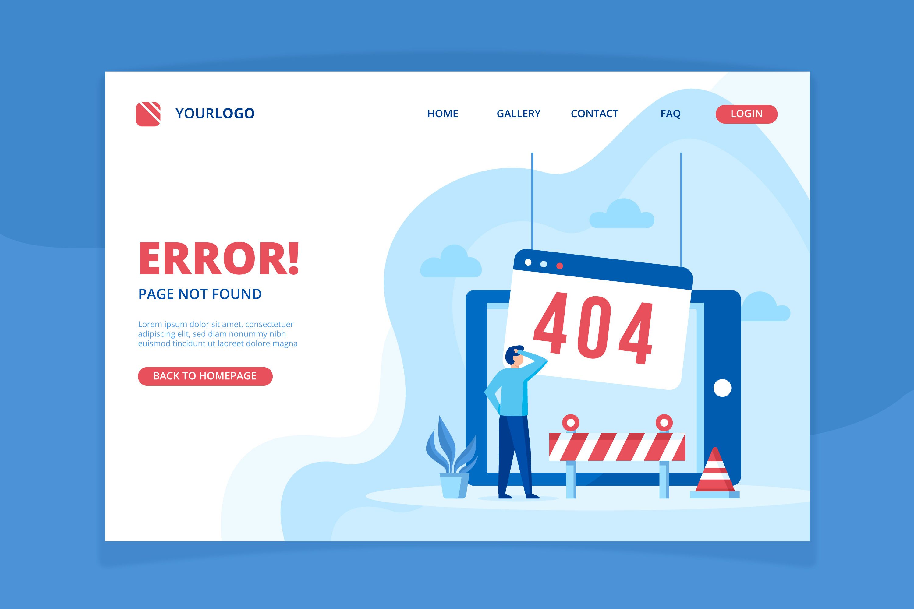
Imagine someone wants to check out your pricing, but boom—404 error. It's frustrating for the visitor and makes your business look sloppy. These dead ends can also affect user experience, lower your credibility, and ultimately, hurt your SEO too.
Do a full link check on your site once a month. Fix or remove broken links, and if you delete a page, make sure to redirect it properly.
Outdated Plugins or Software
If your site runs on WordPress or a similar CMS, keeping things updated is a must. Old themes and plugins don’t just break functionality—they create security gaps.
Update everything regularly and avoid using unsupported themes or sketchy plugins. If you’re not comfortable handling updates, this is something our web design team can help with during routine maintenance.
SEO and Visibility Mistakes
It’s not enough for your website to look good—it has to be findable. Search engine optimization (SEO) helps your site show up when people are looking for the services you offer. But a poor setup can make your site invisible.
These SEO errors are some of the most damaging web design mistakes when it comes to growth and visibility.
Missing Meta Titles and Descriptions
Every page on your site should have a title and description. This is what shows up in Google search results, and it’s how users decide whether to click or not.
Write a unique title and description for every page. Use natural language and include relevant keywords for your specific services. Keep titles under 60 characters and descriptions under 160.
No Header Tags (H1, H2, H3)
Header tags organize your content. They help search engines understand what each section of your page is about and help readers skim for what they need.
Use one H1 per page (the main title), and structure your content with H2s and H3s. For example, on a service page, your H2 might be “What We Offer,” and your H3 could be “Residential Services” or “Commercial Services."
Keyword Stuffing or Ignoring Keywords
Some websites go overboard with keywords, stuffing them into every sentence. Others avoid them entirely, hoping the content will speak for itself. Both approaches hurt your visibility.
Use keywords naturally in headings, body copy, image alt text, and URLs. Don’t force them—just write like a real person. A good rule of thumb: If it sounds weird when you read it out loud, it’s probably too much.
Trust and Credibility Mistakes
Trust is everything. If your site doesn’t build confidence, people won’t reach out. Your website is often your first impression, so make it count.
Be on the lookout for these common web design mistakes that can harm your business's credibility.
No Social Proof
People want to know if others have had a good experience before they commit. Reviews, testimonials, and before-and-after images help validate your claims. Add a testimonials section on your homepage, and sprinkle reviews across relevant service pages. You can also link to your Google Business Profile so visitors can see real reviews in real-time.
No Team or About Page
When people can’t see who’s behind the business, they feel disconnected. A simple “About Us” page makes you feel more approachable and trustworthy.
An About page that shows your team, your background, and what you stand for helps build that human connection. Even a short paragraph and a couple of photos can go a long way. Let people see who's behind the service.
No Clear Contact Info
Some websites bury their phone number or only use a vague contact form. That’s a quick way to lose leads.
Instead, place your phone number and contact options in the header, footer, and on a dedicated Contact page. Include a form, an email, and a click-to-call button for mobile users. The easier you make it to reach you, the more likely people will.
Trying to Do It All Yourself?
We get it—DIY website builders promise quick results. But they often end up costing you more time and business than they’re worth. Templates are generic, the customization is limited, and when something breaks, there’s no one to call.
If you’re serious about growing, a professionally built website isn’t just a “nice-to-have.” It’s part of your sales team. Our team at Ignite Web Design specializes in web design services in Edmonton that are tailored to service businesses like yours. Custom builds. Faster sites. Better results.
Don’t let simple web design mistakes cost you business. At Ignite Web Design & Development, we know what works for service businesses and what drives results. Contact us today to schedule a free website audit!
