7 Edmonton Real Estate Websites to Inspire Your New Website
by Aaron Janes, Founder
If your a business owner, and you want to learn the same strategies that I use to grow my business and my clients, then sign up for my newsletter.

Remember those old-school real estate websites?
Blurry photos, clunky navigation, and contact forms that felt like sending a message in a bottle? Ugh, the frustration! It feels like a lifetime ago since the web was like that, and thank goodness we've been there, done that.
Time to bring everything into the 21st century.
So, as far as modern Edmonton real estate websites go, what should you offer your users?
Well, that's exactly what I’m looking into today as I deep-dive the Edmonton real estate websites that shine brighter than a freshly polished condo.
We'll talk about what works, what doesn't, and I'll even share some insider tips on how you can steal their secrets to make your real estate website pop.
Let's get into it.
EdmontonRealEstate.pro (Liv Real Estate)
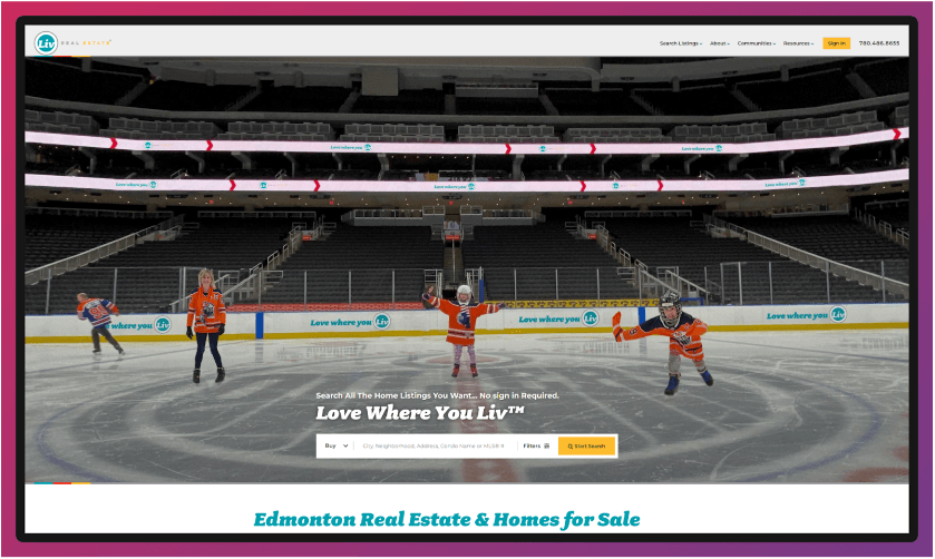
To kick things off, I’ll go out on a limb here and say I'm a huge fan of this site. Front and centre, we have a homely Edmonton photo, a simple search bar with full functionality for users to kick off their search, great SEO content and clear sections for each community area of Edmonton.
This is an excellent example in many ways, as it really covers all bases when it comes to what new homeowners are looking for. The site’s got easy access guides for buying and selling houses, everything's laid out spaciously, and there's transparency in highlighting the team.
What more could you ask for?
What I love:
- Available information: When people come to your website, they're looking for something in particular, and you need to make sure they can quickly find that "thing" without being bombarded by information. Liv Real Estate has done an excellent job of this.
- Branding: I'm a big fan of the branding and aesthetics here. The main points to note are the contrast in colours (turquoise, red, and yellow) and the playful font. The branding is totally consistent across the site, which helps the website (and business) feel consistent, no matter what page you're on.
- Imagery: Imagery is, of course, essential for all websites. But when it comes to real estate, potential buyers need to see where they could live and be able to envision themselves in the community. This site has flush imagery across the site, to help new buyers really embody that home-sweet-home vibe before they even cross the threshold.
Key takeaway
Consistency, consistency, consistency! Take time to mesh all of the key visual aspects of your site together. Nothing should feel disjointed or out of place. You’ll need a set colour palette, flush imagery, and quality copy. Oh, and make sure all features work seamlessly.
Rew.ca
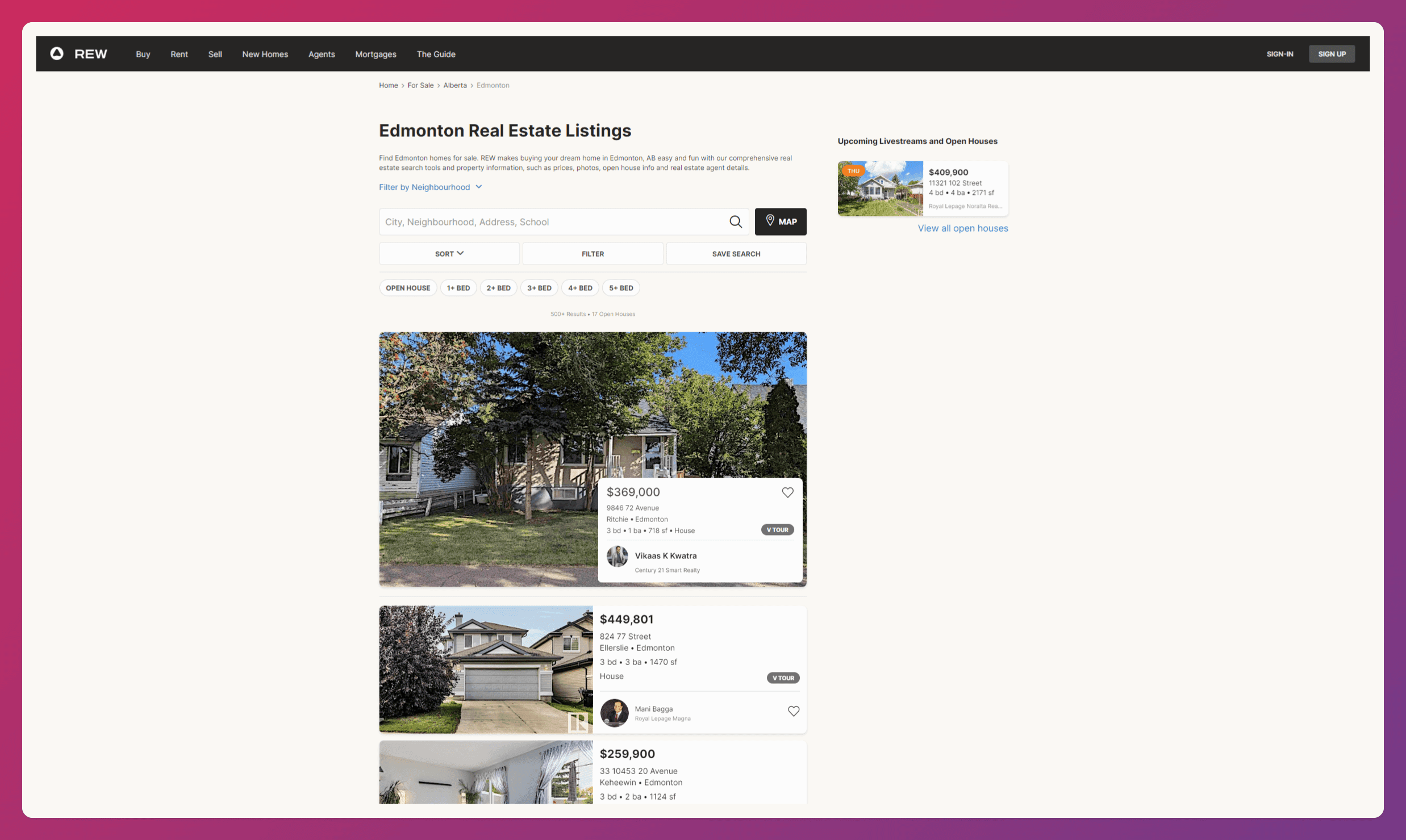
REW has taken me a little by surprise. It looks like a modern UI website in the style and aesthetics department, and it kind of works. The website is fast-loading, sleek, and fluid, with everything laid out beautifully and with a neutral tone that keeps the site from feeling overwhelming.
What I love
- The design: How the website looks and functions is just spot on. I'm a big fan of the info boxes being embedded in the photos, and everything you need to know is there and easy to find. The subtle animations across the website are a really nice touch, too.
- The website features: The features users would need to navigate the website are nicely laid out. The search bar is very comprehensive, with easy-to-find filters, search saves, and text boxes. It's always a good idea to out what your users want front and center.
- Speed: Having a fast-loading website is essential for modern websites, both for ranking high in search engines and giving users a great experience without keeping them waiting. REW nails it with a minimalist website that takes mere seconds to get to any page.
What could be improved:
- A lot of white space: White space is typically a good thing, but there's a lot here, making the website, specifically the homepage, feel empty and unoptimized. They essentially lost the whole right side when they could easily format it into two columns and make use of their available space.
- A poor mobile experience: I'm not a massive fan of the mobile version of REW. I want to see houses and what's for sale, but there's only one horizontal slide bar dedicated to it and the rest is text I don't really care about.
Key takeaway
REW.ca shows us that a modern, minimalist design can be super effective (and easy on the eyes!). They've nailed the sleek aesthetics and lightning-fast loading times. However, remember that white space is like that trendy spice you just bought—a little goes a long way.
Don't be afraid to use it strategically to create a clean look, but make sure you're still serving up a satisfying amount of content. And hey, with more and more folks browsing on their phones, a top-notch mobile experience is non-negotiable.
EdmontonRealEstate.com (REMAX)
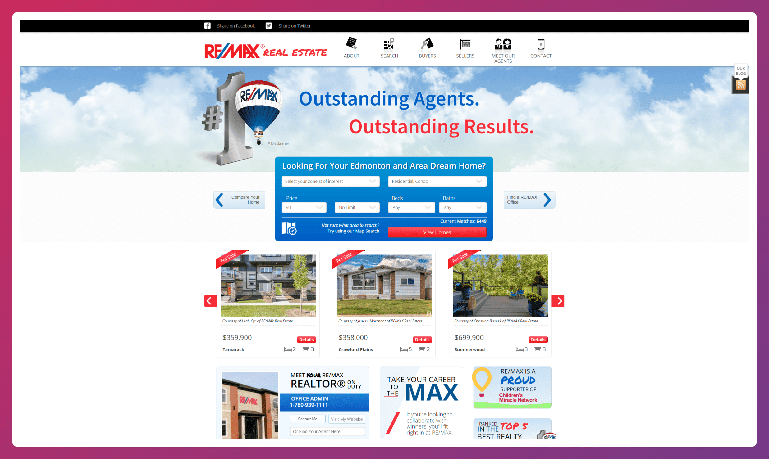
RE/MAX's website strikes a balance between traditional real estate branding and modern functionality.
The bold use of their iconic red, white, and blue colour scheme immediately establishes brand recognition, while the layout attempts to cater to both property seekers and potential agents.
What I love:
- Prominent search function: The search bar takes center stage, making it easy for visitors to jump right into property hunting. The inclusion of multiple search fields shows they understand their users' need for specific filtering.
- Featured listings carousel: The homepage showcases current properties with high-quality images and key details, giving visitors an immediate taste of what's on offer without requiring extra clicks.
- Multi-audience approach: The site cleverly targets both property buyers and potential real estate agents, with clear sections for career opportunities and agent profiles. This dual focus maximizes the site's utility.
What could be improved:
- Busy layout: While informative, the homepage feels a bit cluttered. There's a lot competing for attention, which could overwhelm first-time visitors or those less tech-savvy.
- Dated design elements: Some aspects of the design, particularly the buttons and specific icons, have a slightly outdated look that doesn't quite match the professionalism of the RE/MAX brand.
- Mobile optimization questions: The desktop version seems packed with elements, which raises concerns about how well this translates to mobile devices. A streamlined mobile experience is crucial in today's market.
Key takeaway
RE/MAX's website shows us that established brands can blend traditional elements with modern functionality. They've nailed the immediate presentation of their core offerings – property searches and agent recruitment. However, in the quest to serve multiple audiences, they risk information overload.
The lesson here?
Know your brand strengths, but don't be afraid to simplify. In real estate, as in web design, sometimes less is more. A cleaner, more focused layout could enhance the user experience without losing the essential RE/MAX flavour.
Now Real Estate Group
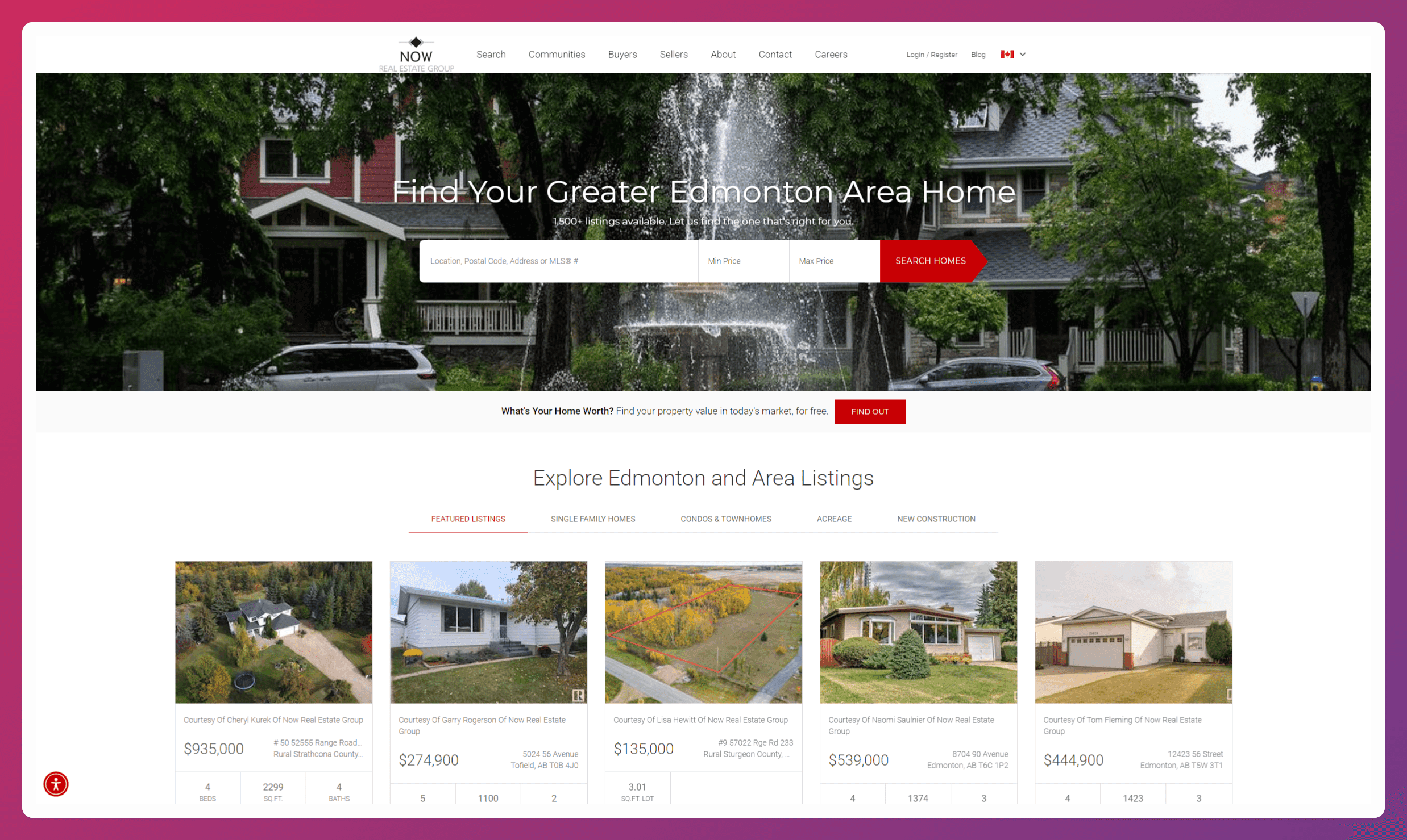
Now Real Estate Group's website is a refreshing blend of modern design and practical functionality. It caters specifically to the Greater Edmonton area and offers a user-friendly interface that balances aesthetic appeal with informative content.
The site immediately engages visitors by focusing on local properties and community insights.
What I love:
- Inviting hero section: The full-width hero image featuring a charming Edmonton street with a prominent search bar is a masterstroke. It sets the local tone and encourages immediate action.
- Clean property listings: The "Explore Edmonton and Area Listings" section is beautifully laid out. Each property card is uniform, showcasing essential details and high-quality images that make browsing a pleasure.
- Community-centric approach: The "Explore Communities and Neighborhoods" section demonstrates a deep understanding of homebuyers' needs, focusing not just on properties but on the areas they'll be calling home.
What could be improved:
- Blog presentation: While it's great to see recent market updates, the blog preview section, with its graph-heavy thumbnails, feels a bit disconnected from the site's overall aesthetic. A mix of lifestyle and data imagery might be more engaging.
- Scrolling length: The homepage, while informative, is quite long. There's a risk that users might miss valuable information towards the bottom.
- Call-to-action variety: While the red "Search Homes" buttons are eye-catching, there could be more diverse CTAs to guide users to different sections of the site (e.g., "Explore Neighborhoods," "Get Market Insights").
Key takeaway
Now Real Estate Group's website? Nailed it. Clean, focused, and they totally get what Edmonton homebuyers want. It's like walking into a perfectly staged open house – you know exactly where to look.
But hey, even the best can improve, right?
Keep it concise, Now Real Estate Group, and give users a few more ways to explore. Turn this website into the ultimate online home base for Edmonton house hunters.
Make every visitor feel like they've found their perfect virtual haven!
TopEdmontonRealEstate.com
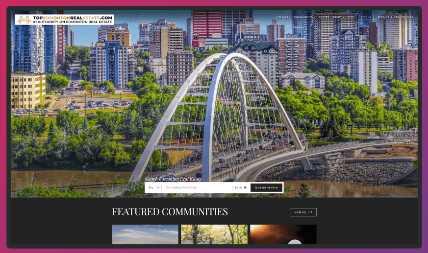
TopEdmontonRealEstate.com presents a visually striking first impression that immediately showcases the beauty of Edmonton.
The website balances eye-catching imagery with practical functionality, aiming to capture the essence of Edmonton's real estate market while providing valuable resources for homebuyers and sellers.
What I love:
- Stunning hero image: The panoramic view of Edmonton's skyline featuring the iconic Walterdale Bridge is breathtaking. It immediately establishes a sense of place and pride in the city, setting a powerful tone for the entire site.
- Featured communities showcase: The grid of community images with overlaid text is both aesthetically pleasing and informative. It gives visitors a quick visual tour of Edmonton's diverse neighbourhoods, encouraging exploration.
- Clear call-to-action sections: The "Register For Free," "Contact A Pro," and "Browse All Listings" buttons are well-designed and prominently placed, making it easy for users to take the next step in their real estate journey.
What could be improved:
- Text readability: While the dark overlay on images helps, some text (especially in the Featured Communities section) could benefit from improved contrast for better readability.
- Mobile responsiveness: Given the image-heavy design, ensuring the site is fully responsive and loads quickly on mobile devices is crucial. The current layout may pose challenges on smaller screens.
- Information hierarchy: The page feels a bit long, and some important elements (like the agent introduction) are quite far down. Restructuring the content hierarchy could help highlight key information more effectively.
Key takeaway
All in all, this website is absolutely stunning. They're not just selling houses; they're selling the Edmonton lifestyle. Gorgeous photos, captivating community stories... it's like they're saying, "Come on in, the water's fine!"
But here's the thing: sometimes, too much of a good thing can be, well, too much. While those visuals are amazing, they might be a tad overwhelming. My advice?
Keep the eye candy, but make the website easier to navigate. Think clearer menus and bite-sized pages. Remember, in real estate, it's all about location, location, location.
Same goes for your website. Make those important details and calls to action easy to find. That’s how you get browsers to become buyers.
EdmontonRealtyExperts.com (Honey Real Estate Team)
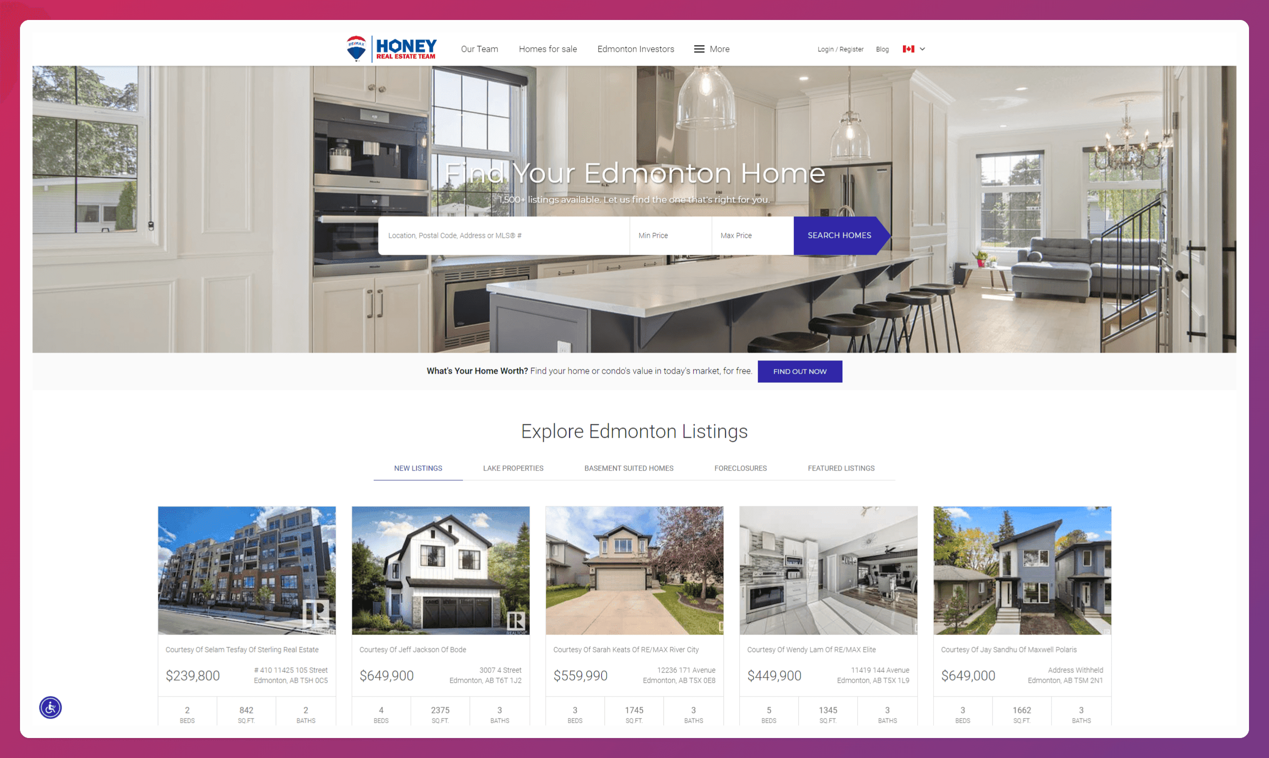
The Honey Real Estate Team's website offers a clean, professional approach to showcasing Edmonton's real estate market.
It strikes a balance between functionality and visual appeal, aiming to provide a comprehensive resource for both buyers and sellers in the Edmonton area.
What I love:
- Inviting hero image: The high-quality photo of a modern, luxurious kitchen immediately sets a tone of aspiration and quality. It's an excellent choice that likely resonates with many potential buyers.
- Clear search functionality: The prominent search bar in the hero section makes it easy for users to start their home search right away. The addition of a "What's Your Home Worth?" call-to-action caters to potential sellers as well.
- Organized listing showcase: The "Explore Edmonton Listings" section presents properties in a clean, grid-like format with essential details readily visible. The use of high-quality images for each listing is particularly effective.
- Market snapshot: The "Edmonton Market at a Glance" section is a smart addition, providing quick insights into the current state of the local real estate market.
What could be improved:
- Underutilized space: The "Edmonton Market at a Glance" section appears to have some missing content or data visualization, leaving a large blank space that could be better utilized.
- Team representation: While there's an image suggesting a team (two people with a camera), it feels somewhat disconnected from the rest of the site's content and design. A more integrated approach to showcasing the team could enhance trust and personalization.
- Mobile optimization: Given the image-heavy design, ensuring the site is fully responsive and loads quickly on mobile devices is crucial. Some elements may need adjustment for smaller screens.
Key takeaway
This website is like a perfectly tailored suit: professional, sharp, and a perfect fit for the Edmonton real estate market. Buyers and sellers alike will find what they need, from dream home searches to property value assessments. It's all there in a clean, user-friendly design.
But here's the thing: even the best suit needs a little something extra, right? I'd love to see more of the Honey Real Estate Team's personality shine through.
Share their expertise, their passion for Edmonton, and their stories. Buying or selling a home is a big deal, and people want to connect with who they're working with.
EdmontonHomesWeb.com
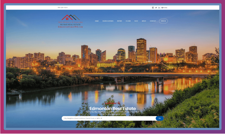
EdmontonHomesWeb.com, operated by Derek Hulewicz, presents a visually striking and content-rich platform for Edmonton's real estate market. The website immediately captivates visitors with its panoramic cityscape and offers a comprehensive suite of services for both buyers and sellers.
What I love:
- Stunning hero image: The breathtaking twilight view of Edmonton's skyline creates an immediate emotional connection, showcasing the city's beauty and setting a prestigious tone for the real estate offerings.
- Clean, intuitive layout: The website's design is sleek and user-friendly, with a well-organized structure that makes navigation a breeze. The prominent search bar atop the hero image invites immediate engagement.
- Diverse property showcase: The homepage features various properties, from urban condos to rural lots, effectively highlighting the range of Edmonton's real estate market.
- Service highlights: The "Edmonton Real Estate Services" section, with its visually appealing grid of options, clearly communicates the breadth of services offered, catering to various client needs.
What could be improved:
- Image quality consistency: While the hero image is stunning, some of the property listing images appear to be of lower quality or show vacant lots, which might not be as engaging for all users.
- Mobile responsiveness: Given the image-heavy design and multiple sections, ensuring smooth mobile performance and responsive design is crucial for on-the-go users.
- Personal branding: While Derek Hulewicz is mentioned, a more prominent personal touch or team introduction could help build trust and connection with potential clients.